FPGA Pin Trends
Overview
I've been working on this project on and off (mostly off) for about the last year. Decided it would finally be a good time to upload (“publish”) the work I've done so far. This is really just part of my 2019 goals of closing out projects. This project is mostly just data download and cleanup. That means I'm basically a machine learning engineer1, huzzah we finally made it. A rough count is loosely 1,000 files and nearly 600,000 pins. In theory I would be looking for some slightly more interesting trends, but I liked what I found, if only for aesthetic reasons.
Goal
A past coworker told me: “In general, 4 IO pins to 1 GND pin is the ratio for big chips". That's such a neat but quiet sentence. I wanted the answer there! Is this true? How long has this been true? Let's go through and try and find out. I've just now realized I never really answered that question - but if you're curious, it should be a trivial change in the code linked above. Try it out and let me know how it goes.
Results
Alrighty, finally the good stuff. Here are the plots I got out of this so far.
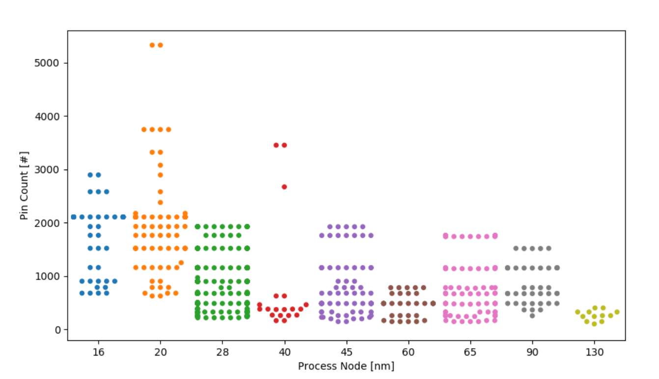
Plotting the total pin count vs the process node (each dot is a unique part). A slow but gradual trend upwards! This one was expected. Swarm plots are beautiful though! I love them so much more than then any other kind of categorial scatter plot. Note this plot is slightly “backwards”: really, 130 nm is the oldest node I have plotted and should be the first data point.
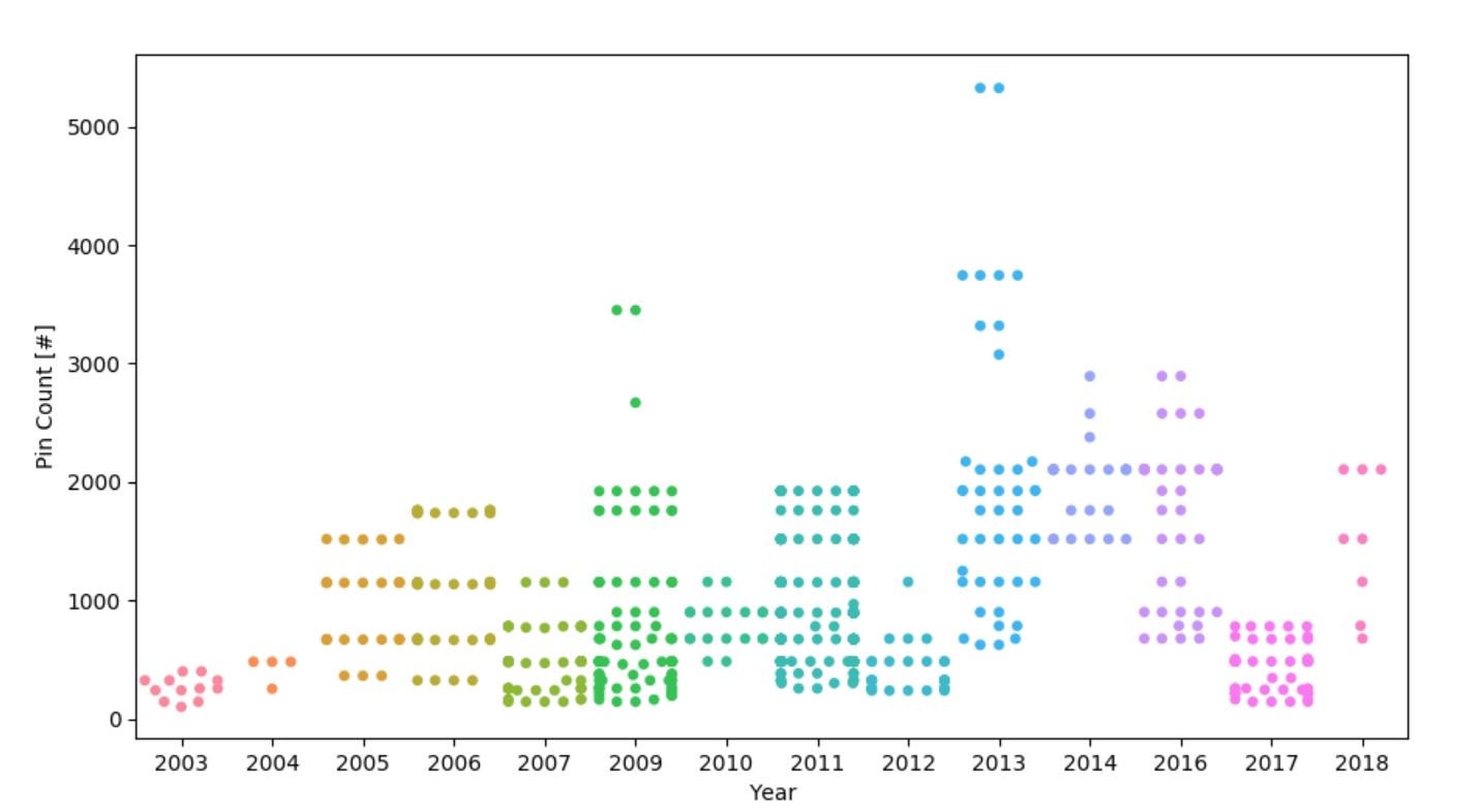
Plotting the total pin count vs the year that part was released (each dot is a unique part). Now here I was slightly lazy with the data: minimal validation was done to see if they released later MPNs in later years. I just assumed everything came out on “Day 1”. If that's not true, my bad team. There's likely a little time lag here as well, as I bet there are more than five parts released last year. Unfortunately, that's all there seemed to be when I started downloading datasets last summer.
I really like the up-down2 nature here. Everyone releases “at the same time” and then takes a breather.
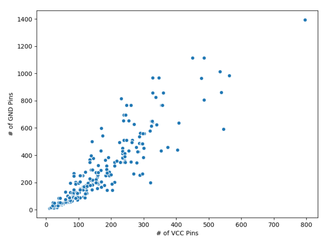
Plotting the number of VCC pins vs the number of GND pins (each dot is a unique part). I drew this a few times trying to capture density correctly, but I kept coming back to the more minimal one. Lots of abstract art vibes here for me: a party popper emoji, a star out in the distance, who knows what you could see? Curious to hear if you see something different.
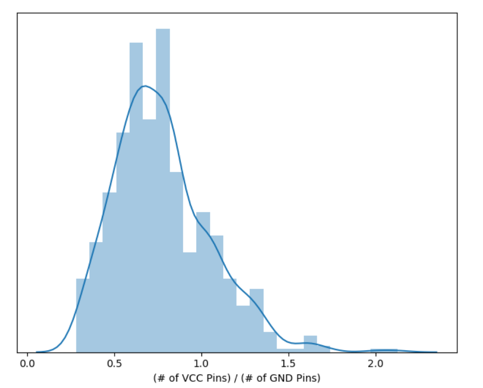
Same thing as the last one, but plotted as a histogram/distribution plot instead. The last one was more artsy than analysis. Here we get a couple quick insights immediately:
- VCC/GND is averaging about 0.75
- VCC/GND is decently normal looking, albeit with one long tail
I would argue it's almost “too good to be true” on the rising edge side. What a beautiful curve!
That's all for now. I'm very, very unlikely to ever update this post, but I do hope to keep working on this in my spare time. I've gotten it to a state where I think it shouldn't be too bad to pick it back up again. If I learn anything crazy new then, I'll make a new post!